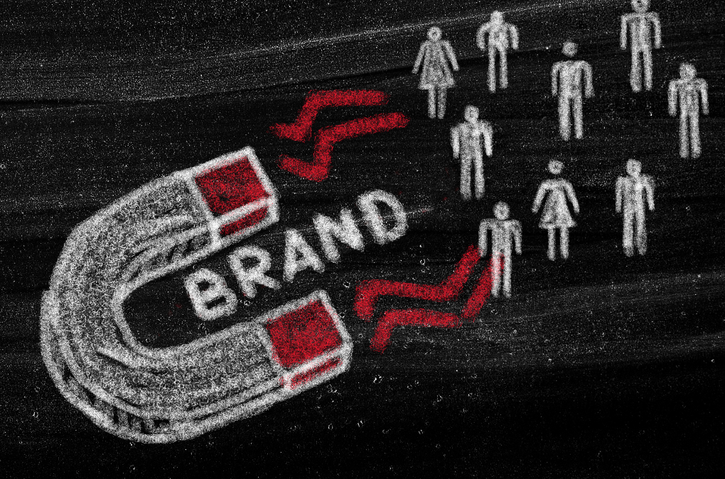
A Logo Is More Than a Symbol — It’s Your First Impression
A logo isn’t just a graphic — it’s the face of your brand. When done right, logo rebranding can be a game-changer that elevates a business to new heights. Many well-known companies have proven that a fresh, relevant logo can boost brand identity, attract new markets, and even increase revenue.
Here are some powerful examples of brands that soared higher after redesigning their logos.
1. Instagram
– From Vintage Camera to Modern Simplicity
In 2016, Instagram shocked the world by changing its iconic retro camera logo to a colorful, minimalist gradient icon.
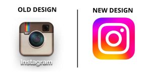
Though the update initially faced criticism, it ultimately paid off.
The result? Instagram became more modern, vibrant, and aligned with Gen Z users and mobile-first experiences — helping it grow even faster globally.
2. Airbnb
– From Startup to Global Lifestyle Brand
In 2014, Airbnb introduced its new logo, the “Bélo,” representing belonging, community, and love.
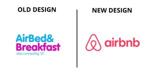
This shift wasn’t just about looks — it was about evolving the brand into a global movement.
Outcomes included:
- A stronger international presence
- Increased trust from users worldwide
- A memorable and unique brand identity
3. Pepsi
– Gradual Evolution, Lasting Impact
Pepsi’s logo has gone through multiple redesigns since 1898. But the bold 2008 update — introducing a new, dynamic “smile curve” — brought a youthful and energetic vibe.
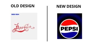
Paired with global campaigns, the new logo helped Pepsi refresh its image and stay competitive with its biggest rival, Coca-Cola.
4. Tokopedia
– Leveling Up for a Bigger Ecosystem
In 2021, Indonesian tech giant Tokopedia rolled out a major rebrand: a new logo, color scheme, and revamped mascot.
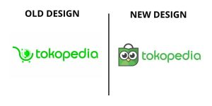
The change aligned with their merger with Gojek to form the GoTo Group, signaling a shift toward regional expansion and a broader digital ecosystem.
The result? Tokopedia’s brand now looks cleaner, more modern, and future-ready.
5. Burger King
– A Nostalgic Comeback Done Right
Burger King’s 2021 rebranding took inspiration from its classic 1999 logo, modernized with flat design and rich colors.
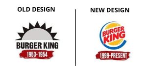
Rather than chasing trends, the brand refined its heritage identity for today’s digital platforms.
Sometimes, the smartest move isn’t a new direction — it’s returning to your roots with a bold new twist.
What Can We Learn?
- Rebranding is more than changing how your logo looks — it’s about aligning your visual identity with your business evolution and audience expectations.
- A strong, well-thought-out logo can build emotional connection, trust, and long-term growth.
Want to Elevate Your Brand with a Powerful Logo?
Let us help you create a logo that:
✅ Is original, memorable, and timeless
✅ Reflects your business values and personality
✅ Looks stunning across all platforms (digital + print)
✅ Makes your brand stand out in a crowded market
💬 Contact us today for a free consultation!